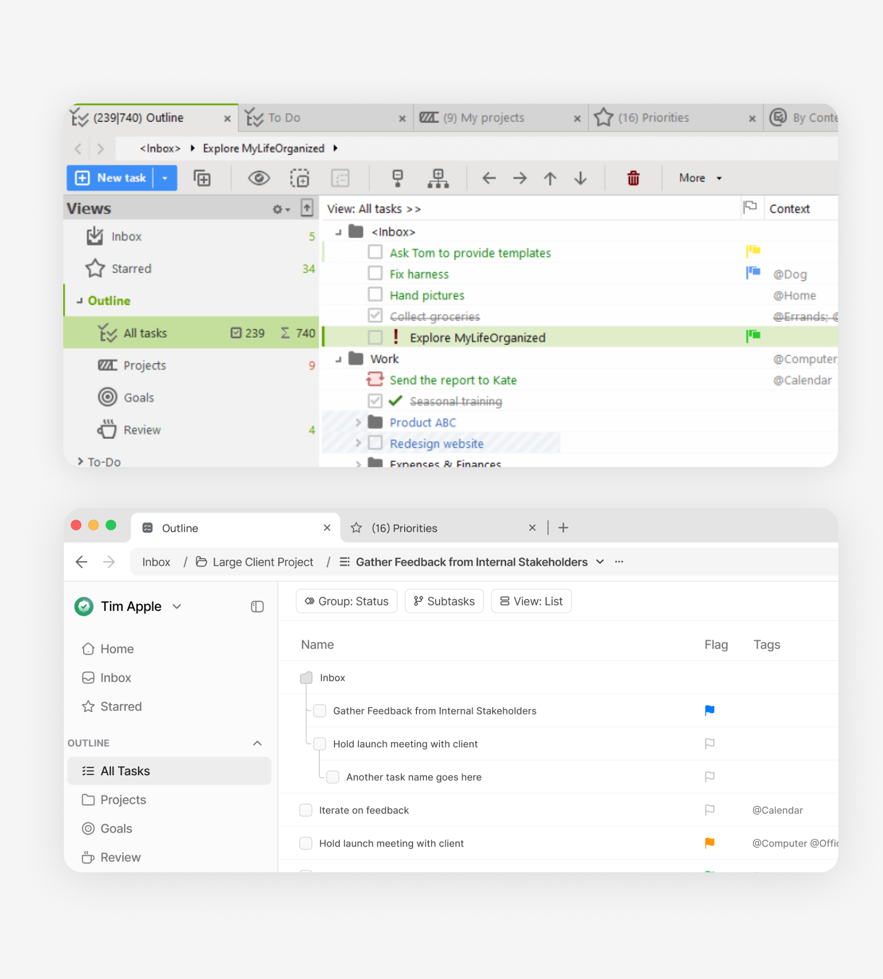
MyLifeOrganized is an application that helps you break free from procrastination by changing how you think and act. The app's core purpose is to help you plan and organize your time to achieve your most important goals efficiently.
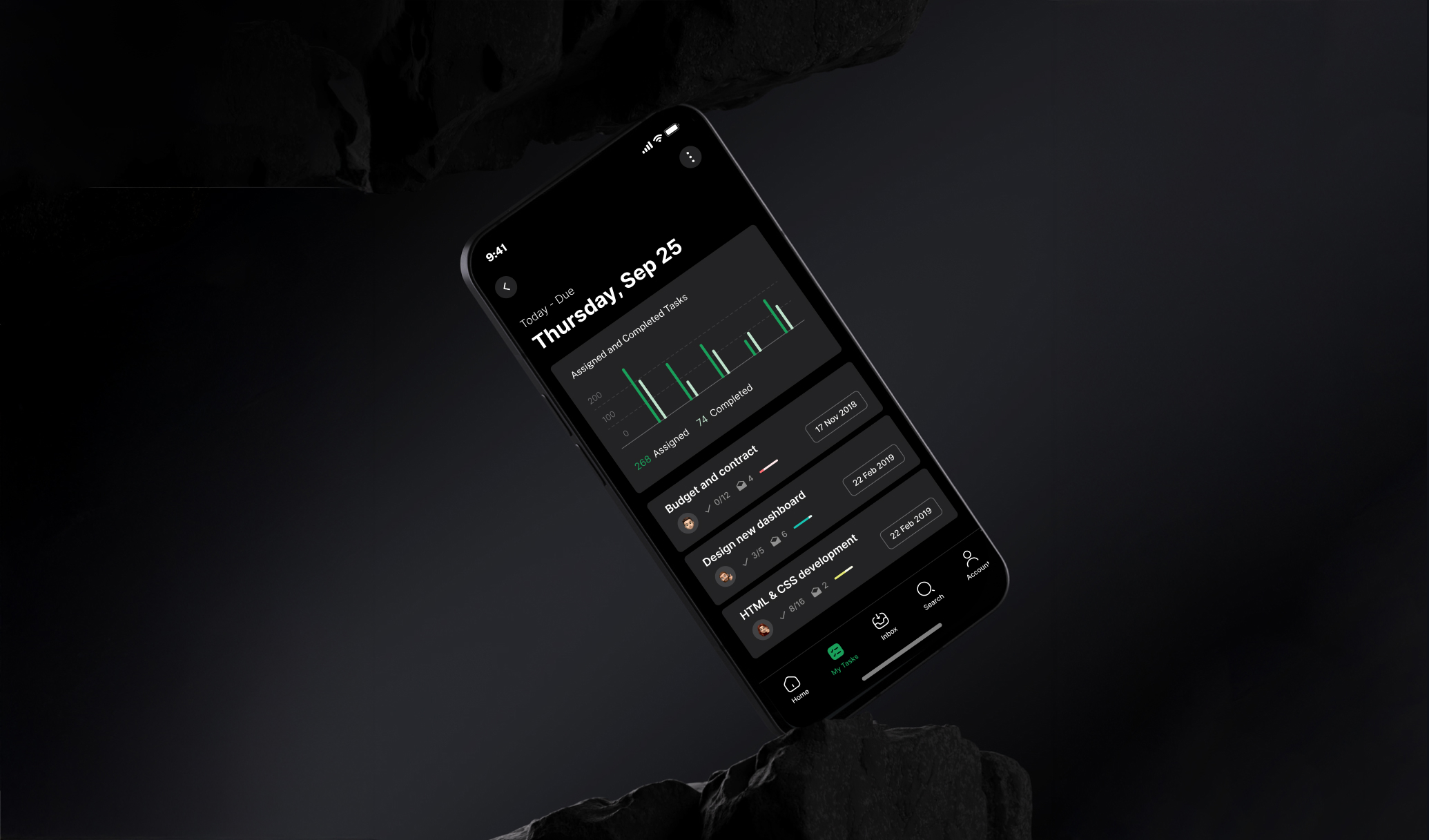
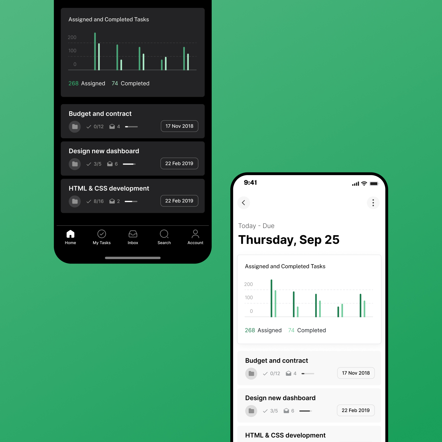
What makes MyLifeOrganized unique is its unlimited hierarchy of tasks and subtasks. This checklist software allows you to create, navigate, and focus on tasks with endless levels of detail. You organize everything in a hierarchical list, and the program automatically generates a sorted checklist based on your input.
I led a comprehensive UX system redesign that transformed the product's interface and interaction patterns.
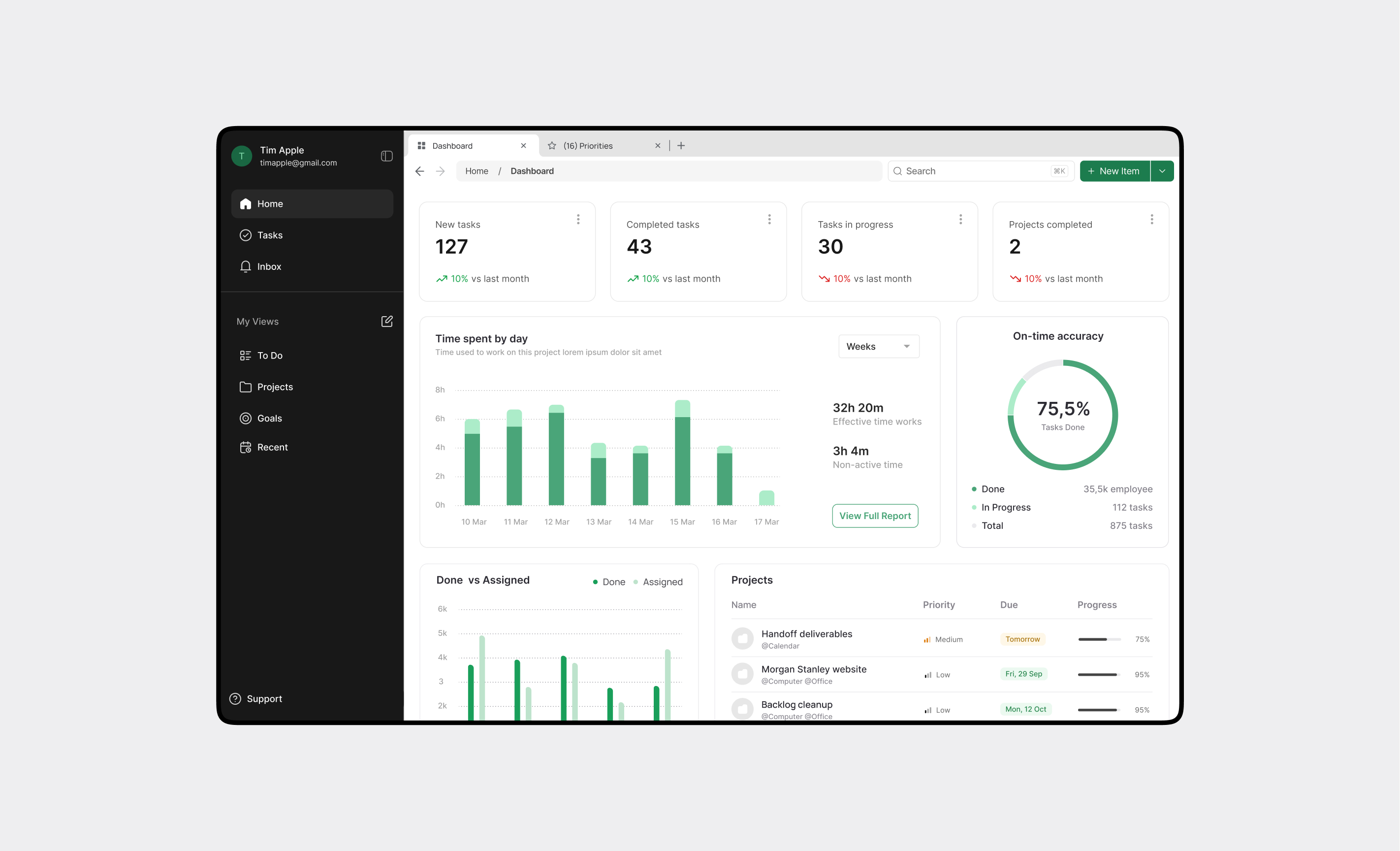
I started with an audit of the existing experience and user research. From there, I restructured the information architecture, iterated on wireframes, and tested flows with users.
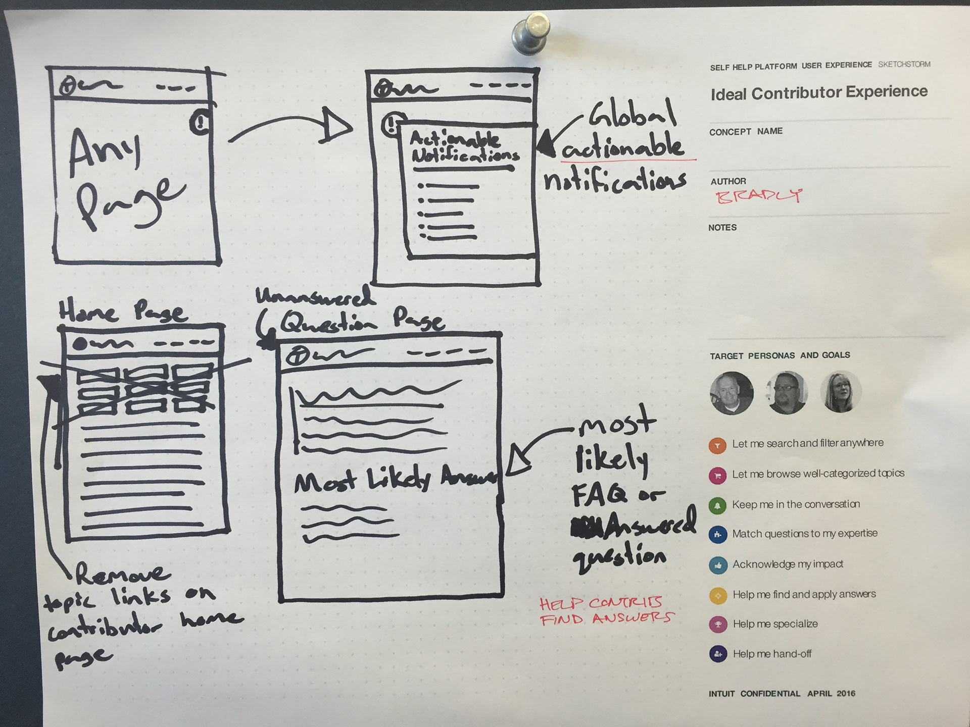
I started by talking to users.
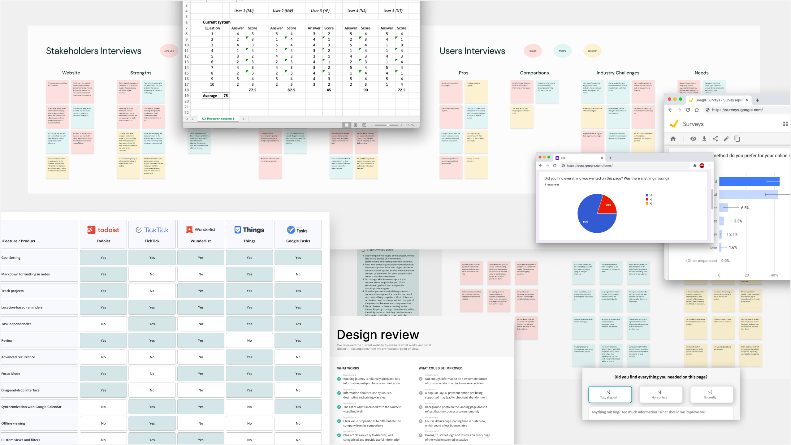
After each interview, we conducted thorough debriefs as a team, capturing observations, quotes, and behavioral patterns. We used affinity mapping to organize hundreds of insights into thematic clusters. This process helped us distinguish between individual preferences and systemic problems that affected most users. The synthesis revealed three critical areas that demanded immediate attention: information architecture, onboarding experience, and cross-platform consistency. These became the pillars of our redesign strategy.
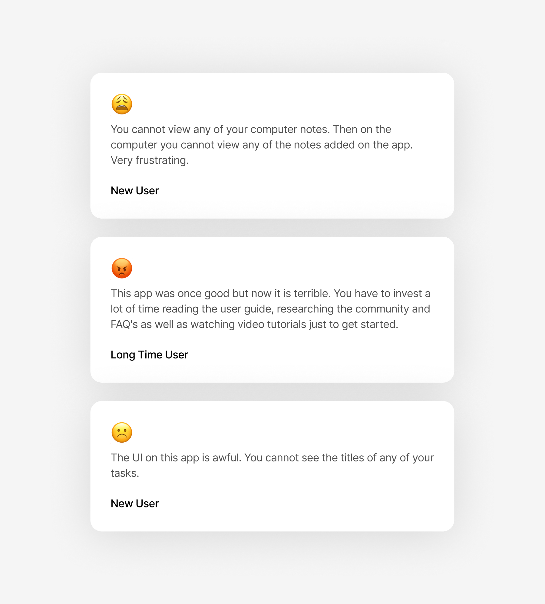
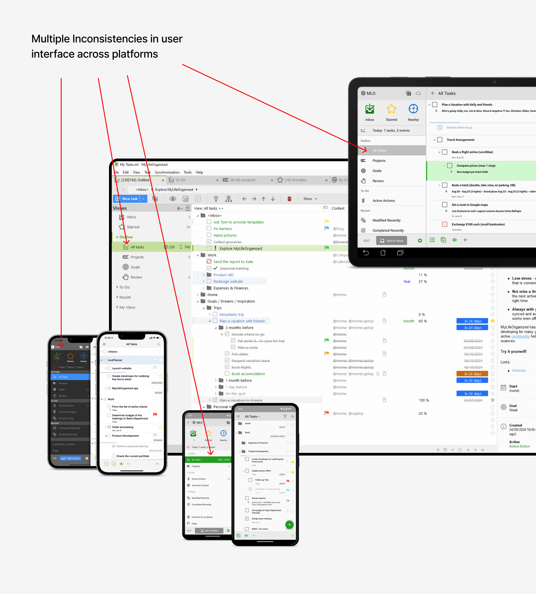
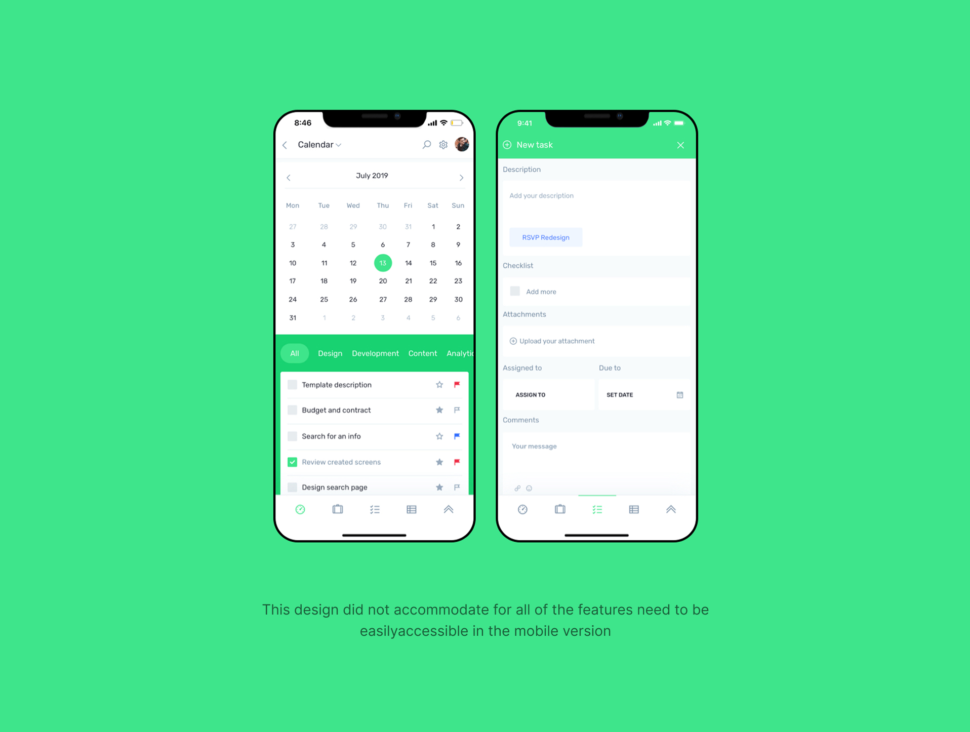
I started by identifying pain points in the user journey. For example, during user interviews we found out that many features users valued were sometimes buried three or four levels deep in navigation.

Documented every touchpoint to identify friction and opportunities for improvement

Analyzed usage data to determine which features to surface, simplify, or remove
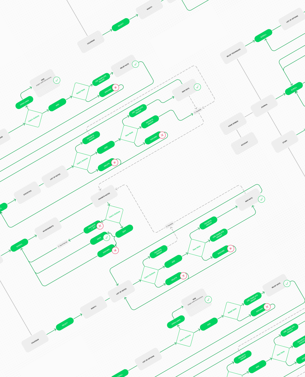
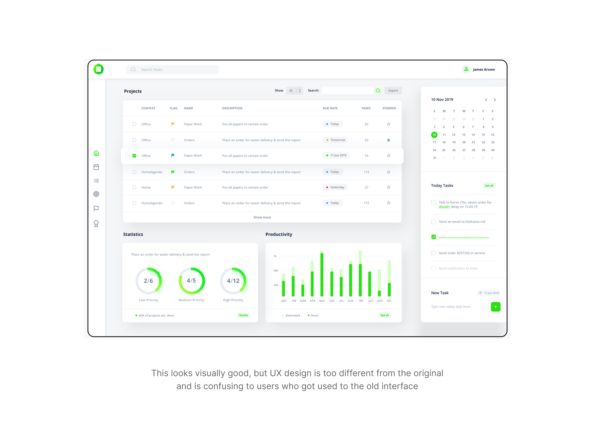
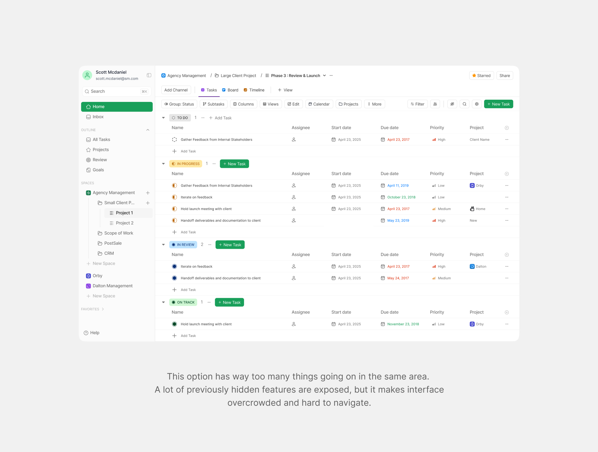
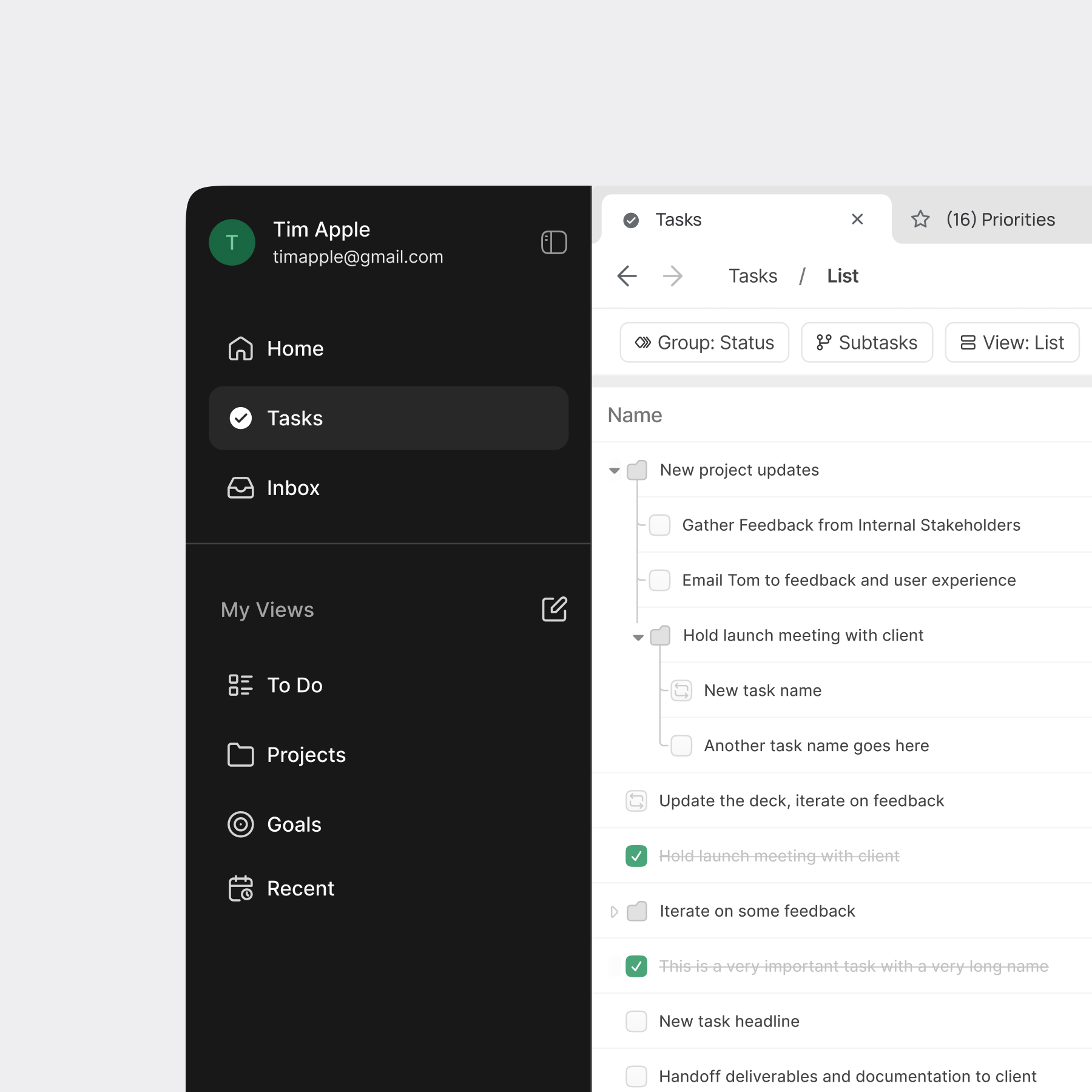
Armed with research insights, I moved into an intensive phase of analysis, prototyping, and testing. This wasn't a linear process, I iterated constantly, creating low-fidelity wireframes to test core concepts, then progressively refining them based on user feedback. Each version brought us closer to a solution that balanced simplicity with functionality.
Sketches and basic wireframes to test core concepts and navigation flow

Clickable prototypes to test detailed interactions and user flows
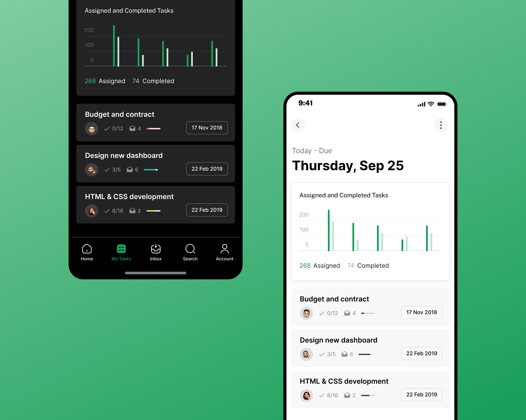
Polished designs with final visual treatment and micro-interactions

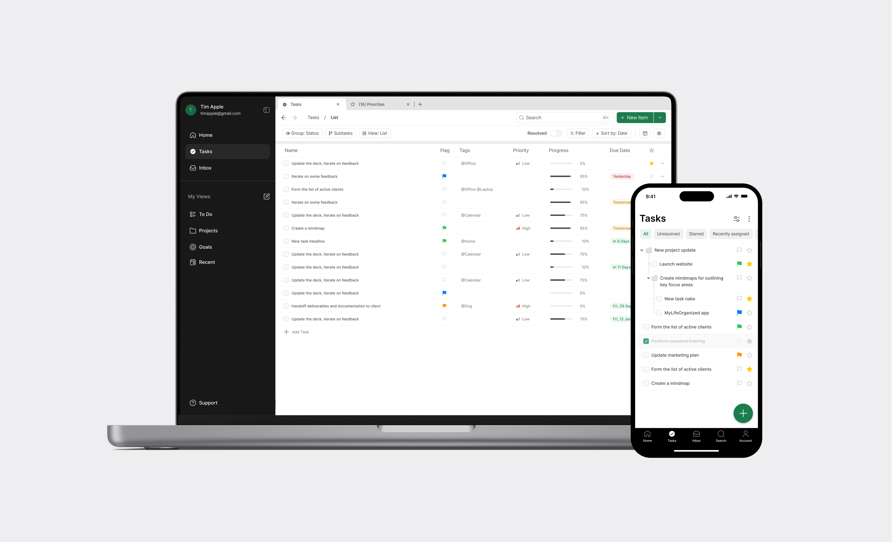
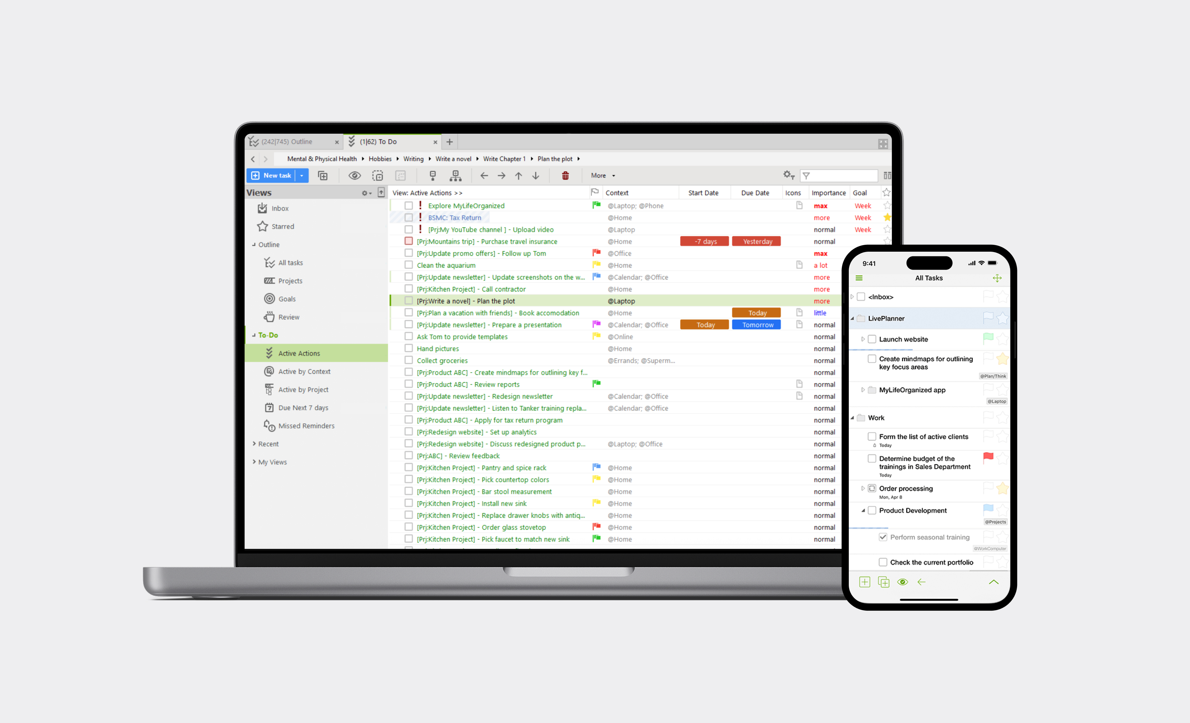
Website
Mobile & Web App
Impact


