
Building an effective design system requires more than just creating components. Success depends on establishing a strong foundation through thoughtful token architecture, well-structured sub-systems, clear foundational styles, and positive team relationships.

Unify design across Aon products to provide a harmonious experience that increases efficiency, minimizes error and decreases friction in the user journey.

Provide a source of truth for design, development and QA that uses the same terminology, patterns and components, ultimately resulting in increased efficiency and productivity.

Reduce the number of decisions designers need to make, so we no longer need to search for the right files and elements, deciding if they fit into the new design.
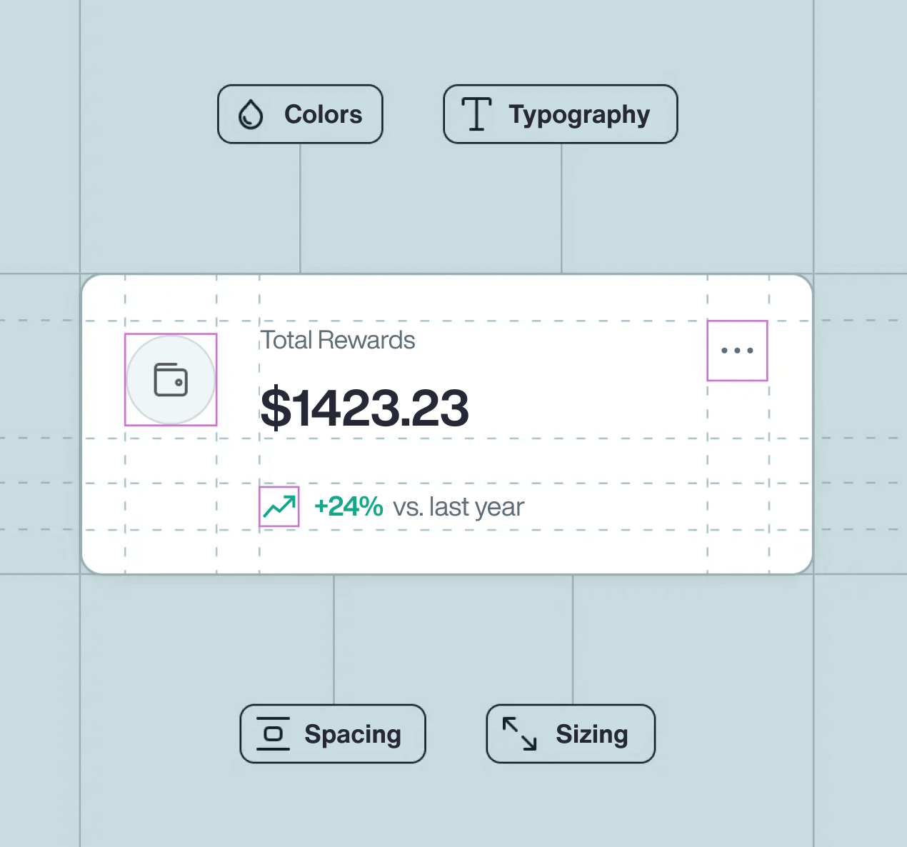
Atomic design allows us to create user UI components in a deliberate and hierarchical manner. In chemistry, atoms combine together to make molecules, the molecules combine together to make organisms and so on. We have applied the same principles to UI elements. The atoms (like typography and color) are combined with other atoms (like input fields) to create a molecule (like a search menu) or an organism (like a contact form).

Basic HTML elements that can't be broken down any further

Groups of UI elements that function together as a unit.

Complex groups of Atoms and/or Molecules, often forming a section within an interface.

An empty page layout that content of a page can be populated with.

A layout made up of atoms, molecules and organisms with product-specific content.
Aon’s Digital Design System relies on the adoption of core foundational elements to achieve consistency within an application and across products
The color palette was created to align with the brand's identity while being versatile enough to accommodate various use cases. We defined primary, secondary, and neutral colors, along with their variations for different states (e.g., hover, active). Each color was carefully chosen for its contrast and legibility, making sure we met accessibility standards right from the start.
8 point layout grid system provides a visual hierarchy to elements and drives consistent scalability with fewer decisions to make while maintaining a quality rhythm.
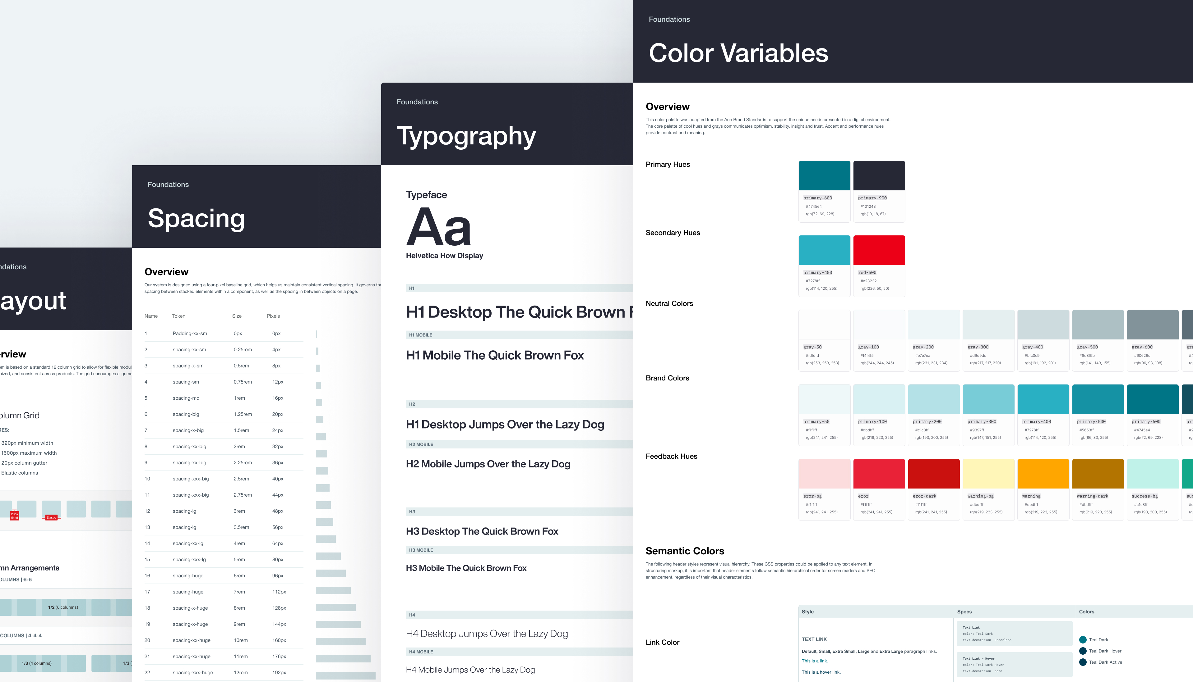
These foundational elements were documented in our design system's guidelines, making it easy for designers and developers to stay on the same page. With this strong foundation, the design system can grow and evolve while keeping the user experience consistent.
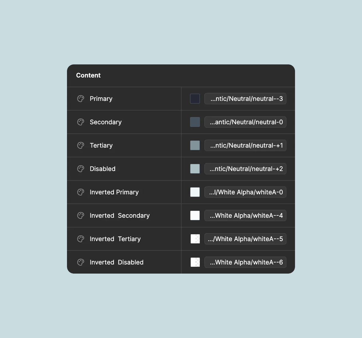
Design Tokens are the smallest, most basic building blocks of the design system. They include values for color, typography, spacing, and more, which can be reused across all components and platforms. They help the design stay cohesive and clean-cut in all instances of use.
Design Tokens help make sure your designs look the same everywhere, but it can be adapted to suit particular needs. Think of them as pieces you can use again and again, making design both simple and matching.
Other designers can click to adjust parts, easily switch between items, and change words. These features help even those new to design create work quickly
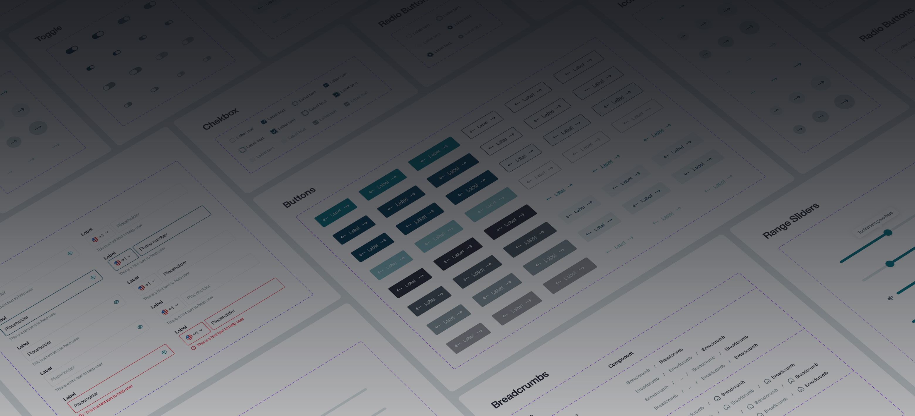
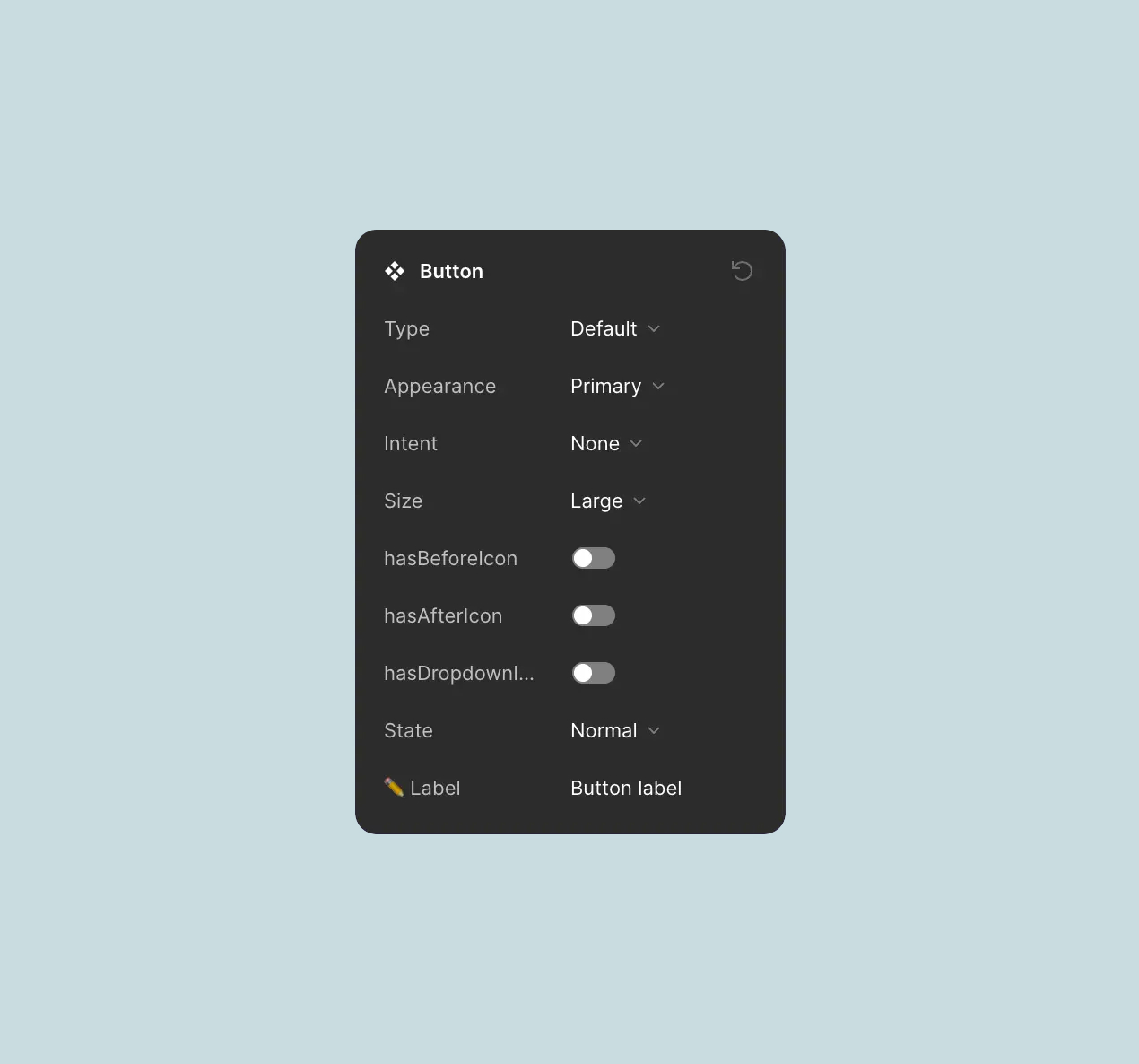
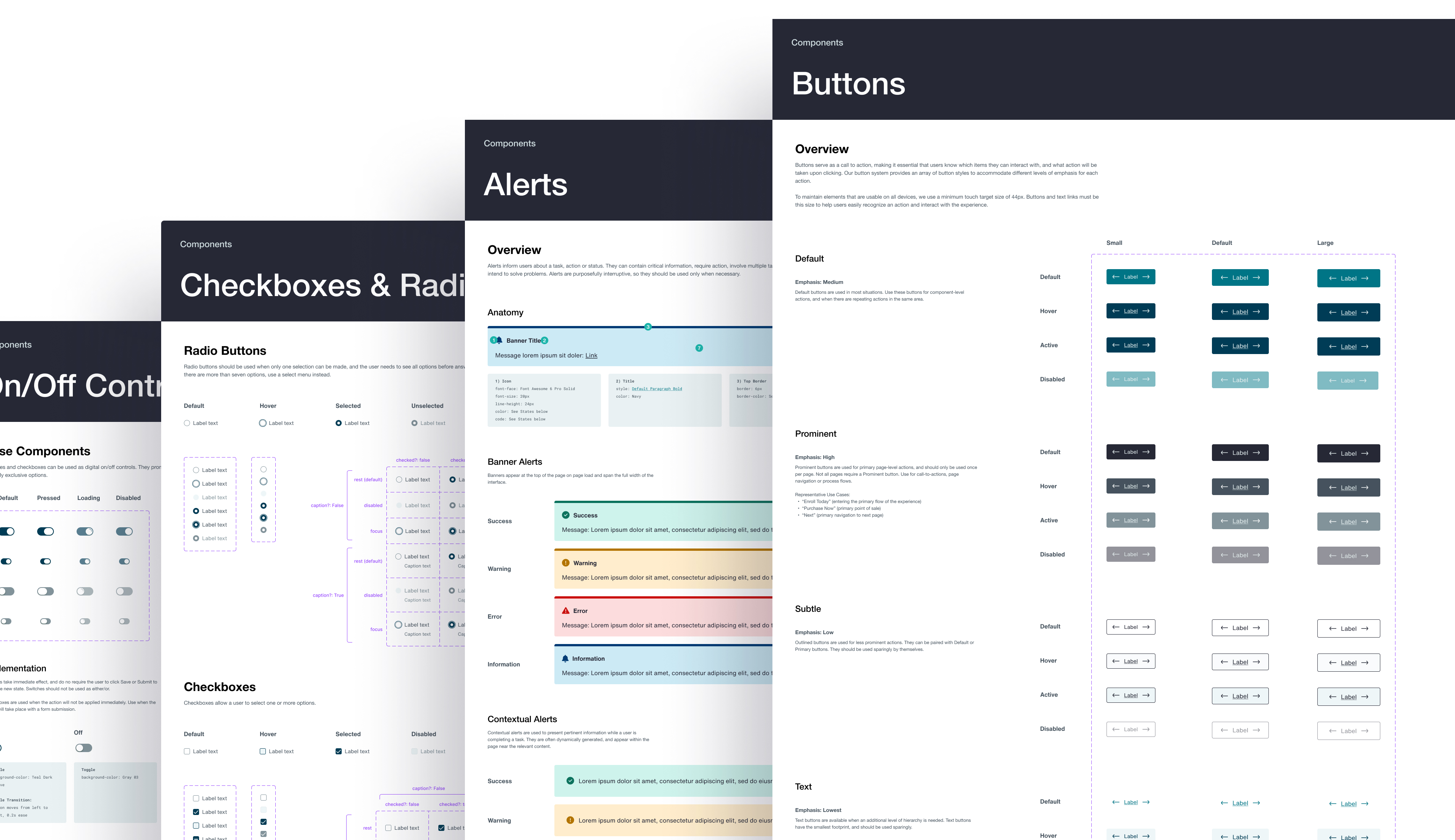
Components are the core building blocks of our design system. They combine foundational elements into reusable, modular pieces that help teams create consistent and accessible interfaces quickly.
I started with common UI elements like buttons, forms, and cards. Built with design tokens for color, typography, and spacing, these components ensure consistency across products and platforms.
I also created more advanced components, including navigation bars, modals, and dashboards. These combine simpler elements into flexible patterns that can be adapted to different use cases without losing consistency.
Modules in our design system are the larger, more complex structures that combine multiple components to create functional sections of the user interface. These modules are where the real magic happens—taking the foundational elements and components and assembling them into more comprehensive and interactive parts of our product.
Think of modules as the building blocks for key sections of our product. Because they’re made up of pre-built components, these modules are easy to tweak and customize, which speeds up the design and development process.

Data visualization acts as the interface between two information systems: the human mind and the computer.
Think of modules as the building blocks for key sections of our product. Because they’re made up of pre-built components, these modules are easy to tweak and customize, which speeds up the design and development process.


